


Summary
- Dividend ETFs are often viewed through yield and income. My analysis shows performance is driven far more by three other ingredients.
- I dig into seven popular dividend ETFs and uncover what’s really driving returns beneath the income-focused marketing and familiar ticker symbols.
- The biggest takeaway: choosing a dividend ETF isn’t just choosing an income stream.
- Looking for a helping hand in the market? Members of iREIT®+HOYA Capital get exclusive ideas and guidance to navigate any climate. Learn More »
Introduction
Dividends attract many people and represent one of the most discussed topics among investors. Dividend ETFs are among the most popular ones on Seeking Alpha. In this article, I want to compare a few key dividend ETFs, which can help us train our thought process around the economic reality of a dividend and correctly use it in our investment strategies.
This is my first article on dividend ETFs, and my sample includes the following: Vanguard High Dividend Yield ETF (VYM
This article has three main sections, which I want my readers to know in advance so that they can skip one if they want. First, I share how I developed my understanding of a dividend. Second, I cover the dividend ETFs I mentioned and explain what they are. In the third section, I share the results of a test I made to see what truly makes these funds move.
How I Came To View Dividends
A few months ago, I joined the Investing Group iREIT+HOYA, where I started running a dividend growth portfolio, which we are building from scratch (we have deployed roughly 20% of the initial capital, so we still have a long way to go). Dividends have always been attractive to me. As a matter of fact, when I first started investing, I only picked high-yielding stocks. However, I have gradually understood them better, especially as I shifted to viewing stocks as a means of acquiring a stake in a business. It is indeed extremely exciting to see money being deposited in our accounts without “doing anything.” The psychological impact is that of receiving “free money” (in academic literature, David Solomon called this the “free dividends fallacy“). This is why a thought process is required because dividends, in reality, are not free money, not at all, really.
I am not anti-dividend; let’s make this clear. But I am pro-economic understanding. After all, think about optical illusions in the desert, when people think they’ve found water, but it’s just a mirage of water that isn’t truly there. That’s the same disillusionment we want to avoid with dividends.
Now, when a company pays a dividend, no economic value is being created, because the payment simply transfers value. This is why stocks adjust their price on the ex-dividend date: a stock that trades at $100 usually trades at $95 on the ex-dividend date if it paid $5 to its shareholders. When the dividend is paid, we see $5 being mailed to the shareholders. The sum is still $100, but $95 is now what the business is worth, while the remaining $5 is in the brokerage accounts of the shareholders. Of course, this is true in a world without taxes. Because of this, once the dividend is paid, the shareholder loses a bit of wealth that is transferred to the government.
This leads us to one big question: what is it that builds wealth? The answer I have come to is that wealth is created by a business’s ability to create value and, through this, to generate growing cash flows over a very long period of time. When we see things in this way, dividends are just one of the many options a business has to allocate those growing cash flows.
That is why I focused on a dividend growth portfolio on iREIT, where I don’t chase yields, but I look for companies with high-quality businesses that can invest their capital at high returns until they generate so much excess capital that they can’t help but pay a dividend. In other words, we seek dividends that should be accompanied by these words from the CEO: “Dear shareholder, we dearly value your capital, and, to the best of our abilities, we have invested it to maximize our returns. Unfortunately, we generate more cash than we can deploy, and this is why we are returning a portion of it to you. We know this places a burden upon your shoulders, as you are entrusted with the task of finding new attractive investment opportunities. Your choice of becoming a shareholder of our company bodes well, however, suggesting you may have the ability to find a way to redeploy your capital effectively. Enclosed is your check, and should new opportunities arise, we will make sure we will be delighted to deploy your capital accordingly”.
Two Dividend Families
You will forgive me for the “dividend theory sermon”. Let’s now get to the “fun” part, which I bet is the reason why you are reading the article. Each of the funds I included in my set tracks an index, which is built with certain rules. It is the differences in those rules that can create very different portfolios, though they are all dividend-focused. I divided the funds into two baskets: the growers and the high-yield funds. The growers focus on dividend growth streaks; the high-yield funds select stocks mainly based on the size of their payout.
The Growers
In this basket, we have VIG, DGRO, and NOBL.
VIG
VIG tracks the S&P U.S. Dividend Growers Index, which includes companies that have at least 10 consecutive years of dividend increases, with the exclusion of REITs. The index also removes the top quartile of the highest-yielding names, under the idea that high yields usually correlate with riskier payouts. Each stock that is included is capped at 4%, but stocks can momentarily stay above that cap between rebuilds. It owns 333 stocks, with the largest sectors it is exposed to being Tech (26%), Financials (21.8%), and Health Care (18.2%). Among its top holdings, we find Microsoft Corporation (MSFT
DGRO
DGRO tracks the Morningstar US Dividend Growth Index, which uses as its main stock selection criteria a 5-year streak of consecutive dividend increases, a forward payout ratio below 75%, and removes the top 10% high-yielders, as well as REITs. The weights are decided based on the dollar amount of dividends that each company announces it will pay. This is the key difference with VIG, because a company that pays $2B in dividends is going to have a larger weight here than a company that pays $1B in dividends, independently of their market cap. The fund’s top three sectors by exposure are Financials (19.6%), Technology (18.8%), and Health Care (17.4%). The top holdings include Microsoft (3.2%), Apple (3.16%), ExxonMobil (3.1%), and Broadcom (2.8%). But we also have other stocks such as AbbVie, Inc. (ABBV
NOBL
NOBL tracks the S&P 500 Dividend Aristocrats, which all of us know includes the S&P 500 members that have raised their dividend for at least 25 consecutive years, weighted equally, with a 30% sector cap. Consumer defensive has a 21% weight, followed by industrials with 20% and financials with 13%. This is why it is really of no use considering what its top holdings are, as they basically depend on how the stocks did from one rebuild to the next. It is the most expensive fund (0.35% expense rate), and it is actually the one that performed worst in our set, as we will see in a moment. Its dividend yield is 2.01% (SEC yield 2.09%).
The High-Yield Funds
In this basket, we have VYM, HDV, SPYD, and SCHD, although this one is an ETF that is actually a hybrid of the two.
VYM
VYM tracks the FTSE High Dividend Yield Index. It picks dividend-paying companies from the FTSE US All Cap. Again, REITs are excluded, and the holdings are ranked based on their forecasted future yield and weighted based on their market cap. Therefore, the largest companies dominate, with Broadcom as the top holding with a weight of almost 7%, followed by JPMorgan (3.83%) and ExxonMobil (2.69%). The largest exposure is to financials, which have a weight of 21.82%, followed by technology with a 16.39% weight and health care with 13.57%. The dividend yield is 2.31% (SEC yield 2.35%).
HDV
HDV tracks the Morningstar Dividend Yield Focus Index, which includes companies that either have a narrow or wide moat rating and that must not have an uncertainty rating of very high or extreme. The idea is to include companies whose credit-risk measure is low. Then the 75 stocks with the highest yield are selected and weighted by dividend dollars, with a 10% cap. The filters allow the fund to avoid some high-yield traps and tilt the fund toward high-quality names. Its top sectors are Consumer Defensive (26.83%), Energy (24.40%), and Health Care (13.46%), with its top two holdings being ExxonMobil (9.27%) and Chevron (6.99%), followed by AbbVie, Verizon Communications Inc. (VZ
SPYD
SPYD tracks the S&P 500 High Dividend Index
SCHD is what I would call the hybrid. It tracks the Dow Jones U.S. Dividend 100 Index, which looks for stocks with a dividend growth streak of at least 10 years, then keeps the higher-yielding 50% and ranks the companies based on their FCF/debt ratio, ROE, yield, and 5-year dividend growth rate. In this way, it chooses the top 100 names and weighs them by market cap with a 4% cap for stocks and a 25% sector cap. REITs are excluded, and the ETF is rebuilt once a year (usually in March). Its top sectors are health care (19.15%), consumer defensive (18.09%), and technology (15.65%), but energy is close behind (15.35%). Among its top stocks, we find Texas Instruments Incorporated (TXN
The Test: What Moves These Funds
Now, while all of these funds focus on dividends, if you followed what I said in the first paragraph, you will understand why I am going to rank them based on their dividend yields, but I am going to discuss how these funds behave because of their underlying assets. To do so, I did something quite simple, which any college student who has taken a statistics class can do: I ran a simple regression on 406 weeks of total return (from January 2019 to October 2026), pulling the data from Yahoo Finance. This regression explains how these funds move with three variables: the stock market (SPY
These three ingredients stand for one of the three common claims that we usually hear about dividend funds. SPY is used because some say that dividend funds are, after all, stock funds first. IWD-IWF is used because dividend payers are usually considered value stocks. Treasuries are included because dividend-paying stocks can sometimes be considered as bond substitutes.
The regression looks at all 406 weeks for each fund and finds how much of each variable, when mixed with the others, comes closest to the fund’s real return week after week. I find that at least 90% of the share of moves is explained by these three for six of the seven funds, with only HDV at 86%.
Below, you see the numbers I found, which show the amounts and the share of moves that are explained by these ingredients. Of course, I didn’t consider many other variables, but I think what we see below is interesting.
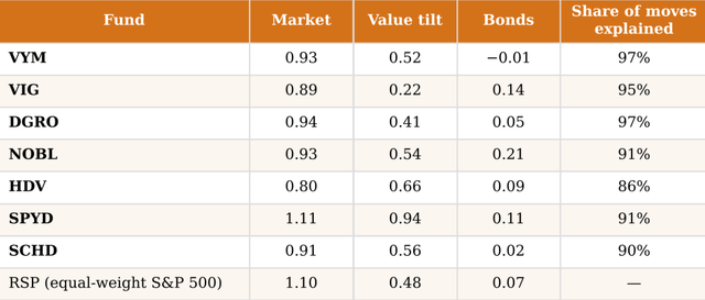
The first three columns show the three regression coefficients (the betas), meaning that each one measures, for each fund’s weekly return, what happens, on average, when that ingredient moves by 1%, while holding the other 2 constant. The last column is what we usually call the R², that is, the share of the variance for weekly returns that the three ingredients explain together. With R²s very high, we see that almost everything that these funds do depends on the three ingredients we are considering.
Let me read the table together with you now.
VYM moves almost one-for-one with the market. In fact, when the market rises 1%, VYM goes up 0.93%. When value stocks beat growth stocks by 1% in a week, VYM gains on average an additional 0.52% on top of the market beta. This means that if the market is up 1% and value beats growth by 1%, VYM rises by 1.45% (0.93% + 0.52%); if the market is flat and value beats growth by 1%, VYM goes up by 0.52%. When Treasuries move, VYM does nothing. These numbers capture 97 of 100 units of VYM’s weekly movements, which means that VYM is actually the market with extra value exposure.
VIG shows 0.89 market, 0.22 value, 0.14 bonds, and 95% explained. This means that when the market moves by 1%, VIG moves by 0.89%, a little less than VYM. When value stocks beat growth stocks, VIG gains an additional 0.22%, which means that if the market is up by 1% and value beats growth by 1%, VIG, on average, goes up by 1.11%; if the market is flat and value beats growth by 1%, VIG gains 0.22%. VIG is more sensitive to bonds than VYM. If bonds go up, VIG gains an extra 0.14%, which is in part consistent with the fact that it holds high-quality companies that generate steady profits. These ingredients capture 95% of 100 units of VIG’s weekly movements, meaning that VIG is a large-cap fund with a moderate value tilt and some bond exposure.
I think you get the idea by now, so I will be quicker.
DGRO’s market beta is 0.94 (when the market moves by 1%, DGRO moves by 0.94%). When value beats growth, it adds 0.41% on top of the market beat (when the market is up 1% and value beats growth by 1%, DGRO rises by 1.35%). Its sensitivity to Treasuries is too small to matter: just 0.05.
NOBL has a market beta of 0.93 and a value tilt beta of 0.54. It looks a lot like VYM here, but the difference is in bonds: when Treasuries rise 1%, NOBL gains an extra 0.21%, meaning that a fifth of every Treasury move passes through to the fund. It is the fund with the strongest link to Treasuries.
HDV is the least sensitive to the market of this group, with a beta of 0.80. But its value tilt beta is high: 0.66, meaning that when the market goes up 1% and value beats growth by 1%, HDV usually gains 1.46%. Its sensitivity to Treasuries is low: 0.09. Since it is a concentrated fund with exposure to consumer staples and energy, it is the one with the lowest share of moves explained: 0.86. The other 14 points could probably be found by looking at its sectors. HDV is a defensive value fund, where sector choices matter more than for its peers.
SPYD is the only dividend fund with a beta higher than 1, meaning that it moves more than the market: 1.11. When the market goes up 1%, SPYD usually gains 1.11%. Its value tilt is also the strongest: 0.94. So, when the market is up 1% and value beats growth by 1%, SPYD gains 2.05%. It also has a Treasury beta of 0.11, which means that if Treasuries rise 1%, SPYD gains an extra 0.11%. SPYD is thus a value fund “on steroids”, so to speak, and is able to amplify the market movements and the value vs. growth swings.
SCHD has a market beta of 0.91 and a value tilt beta of 0.56. When treasuries move, SCHD does nothing (beta of 0.02). This is consistent with its construction: it is the market with a strong value tilt and a few bets on specific sectors.
You see that I also included the equal-weight index for reference. It moves a bit more than the market, with a beta of 1.1, and it has a value tilt beta of 0.48. Giving an equal weight to each stock in the market produces a value tilt close to that of a dividend fund such as VYM, SCHD, DGRO, and NOBL.
Now, these are average weekly relationships from 2019 to 2026, so we have to consider these measures as moves that “on average” happen.
Economic and Investment Takeaways
First of all, dividends don’t really matter. In fact, we are considering total returns, which include dividends that are reinvested. The ingredients that matter for these funds are the market and their exposure to value, with some that are more sensitive to Treasuries.
Second, most of these funds are quite sensitive to the market, but what separates them is the value beta. This is linked to how each fund creates its own yield rules. Funds that cap yield have a lower value tilt beta (VIG 0.22, DGRO 0.41), while funds that want a high yield have higher value tilt betas (HDV 0.66, SPYD 0.94). VYM is more or less in the middle with 0.52.
Therefore, choosing a dividend ETF actually means that we are choosing how much value we want. It is a choice of the value dose, so to speak.
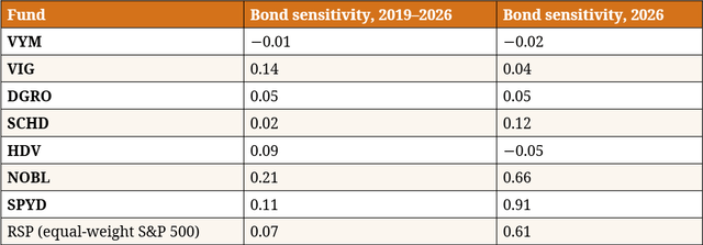
Now, there is a third takeaway, which is a bit more complex. We see that some funds are a bit more sensitive to Treasuries. I don’t want to confuse my readers, but I would call these funds “bond-linked”. Now, the Treasury betas I showed above in the table represent the 2019-2026 window. However, when we look at what has happened YTD, we see that the 2026 bond sensitivity changes, with NOBL increasing it to 0.66 and SPYD moving from 0.11 to 0.91. We would think that growers and high-yield funds have different rate sensitivities, but the data points are in another direction. In fact, NOBL is a grower while SPYD is a high-yield fund. YTD, both are “bond-linked”. But they are equal-weight funds, and when we consider RSP, we see that its bond sensitivity increased, too, from 0.07 to 0.61. SPYD also reflects its exposure to REITs, which are quite impacted by interest rates. When stocks and bonds fall together, a typical explanation is an inflation-driven shock. It is what is currently happening.
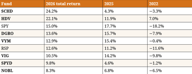
Let’s now see another table that shows what is happening YTD, what happened last year, and what happened in 2022, when interest rates rose.
This year, value is beating growth by a wide margin (IWD is up 22.4% against IWF), also because of energy and health care, which have done really well. SCHD and HDV have thus benefited the most. At the same time, the 7-10Y Treasury ETF is down 4.2% YtD, which has impacted SPYD and NOBL the most. In 2025, growth beat value, and this is why we see that SPY outperformed every other fund. This year, however, SPY is in third place, still beating most of the other funds, apart from SCHD and HDV.
What happened in 2022 is also interesting. SPY lost 18.2%, while most dividend funds did much better, with HDV actually finishing in the green by 7%. Bonds fell 15%, but SPYD and NOBL did, in any case, better than the market thanks to their overall lower bond sensitivity and their value tilt.
The long run tells something different: over the 5-year and the 10-year windows, SPY outperformed. This is because dividend funds own little technology exposure, and it is technology that has driven the market for the past decade (if not more).
In an environment where the 10Y yield stays above 5%, equal-weight funds will probably do poorly, while the value tilt will decide the performance, depending on whether value keeps beating growth and for how long. In a rate-cut scenario, NOBL and SPYD are the likeliest winners. In an AI-led growth rally, dividend funds will simply lag the market, although VIG should mitigate the underperformance.
To me, VYM appears to be the neutral starting point. It is cap-weighted, which protects it from bond sensitivity, and it has a middle value tilt of 0.52, which means that a growth rally hurts it less than HDV or SPYD. Its breadth is also considerable (610 stocks), which makes it behave closer to the market, holding significant exposure to technology. The cost is also quite cheap (0.04%), and it has shown in 2022 that it can hold up quite well against rate shocks. VYM has trailed SCHD and HDV by 10 points this year, but this is because it is less exposed to energy and health care. This could create a situation where VYM closes the gap with SCHD and HDV in 2027 and 2028, if energy stocks don’t grow as fast or if they come down a bit.
Conclusion
When we deal with dividends, we are at risk of entering a camp where investors have already picked their side: “free-moneyists” against “tax-inefficientists”. What I wanted to show is that neither camp actually looks at this aspect correctly: once we consider the market and the value factor, the dividend doesn’t really explain anything about how a fund behaves. The real choice is on what rules we want a part of our portfolio to abide by: it is the rules that buy the stocks, filter for value, and add interest rate risk. Choose a dividend ETF for the rules that build the portfolio and not for the label; that is what I think the main takeaway is.
More on my IG service
I partner with iREIT®+HOYA Capital – the premier income-focused investing service on Seeking Alpha. Based in Europe, I bring a long-term, fundamentals-driven perspective to dividend growth investing, coupled with a broader macroeconomic perspective.
Get started with a Free Two-Week Trial and take a look at our top ideas across our exclusive income-focused portfolios. With a focus on REITs, ETFs, Preferreds, and Dividend Champions across asset classes, members gain complete access to our research and our suite of trackers and portfolios targeting premium dividend yields up to 10%.