

Summary
- The S&P 500 is at risk of heading much lower than many think.
- This is not hyperbole; it is based on a combination of historical analysis and the realities of the current market climate.
- While history doesn’t repeat exactly, human nature has a way of making it “rhyme” with the past.
- The technical condition of the broad stock market looks terrible on an intermediate-term basis.
- There’s always a chance for a “save” – e.g., by the Fed – but inflation completely changes the calculus.
Remember back in late March of 2020? The S&P 500 (SP500) had just lost about one-third of its value in five weeks. It fell from around 3,400 to just under 2,200. Lockdowns, panic, and red ink on stock portfolios were everywhere. Then, like it was shot out of a cannon, yet another extension of the 11-year bull market that began back in 2009 commenced. But if this “new era” of investing in the stock market plays out the way it appears to be, based on current charts and recent history, that 2,200 level from late March 2020 could be the S&P 500’s ultimate destination before this bear market cycle concludes.
Current Evidence
In this new era of inflation, Fed-obsessed investors, algorithmic trading, and index-driven investment flows, the market is more of a confidence game than I’ve seen in three decades of investing professionally. And that confidence is fading, drop by drop. As a 42-year chartist, my evidence always ultimately boils down to a picture. Here’s one to explain it to you.
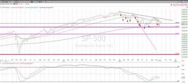
This a technical chart (weekly prices) of the S&P 500 back to late 2019, so you can see how far we’ve come – and, perhaps, where we are going again. Because while any investment or index can rise in price at any time, the intermediate-term risk attached to nearly any market segment, theme, industry, or sector right now is high. Historically high.
What do I see in this chart? The top section of graph (price pattern) and the price percent oscillator (PPO) momentum indicator in the bottom section of the chart shows at least three important warning signs for those who are counting on a “quick fix” to the current stock market malaise.
That Stubborn Trendline
Since Jan. 4 of this year (the second trading day of 2022), the S&P 500, and most of the global stock market, has been in a clear downward trend. That’s the black line shown toward the top of the chart. Think of this line as marking the rite of passage if a new bull market is going to start anytime soon. The bulls have had three cracks at it – in April, August, and earlier this month. In all three cases, the result was, as we technicians say, “failure.” The S&P 500’s price failed to cross above and stay above that downward trend.
Frankly, breaking above that downtrend line is a pretty low bar for hopeful bullish stock investors right now. It would take a convincing, sustainable move toward the 4,300 area to negate all of the downward pressure that stocks have experienced this year. And that is still more than 10% from the S&P 500’s all-time high level around 4,800.
Those Darn Red Arrows
A more detailed version of what you just read above is to see how many false rallies we’ve had during this eight-month downtrend for stocks. Every red arrow I drew into the chart marks a moment where bullish investors (and Wall Street firm cheerleaders, who need bull markets to keep their revenues flowing) might have felt that “the bottom was in.”
Well, there are 12 red arrows on that chart, and one orange arrow at the far right, as the recent market malaise sorts itself out. That’s a lot of failure, and lends strong evidence to my belief that the most likely intermediate direction for the S&P 500 is down – a lot.
Watch Out for the Cross
I’ll spare you a full dissertation on the PPO, except to tell you that in 42 years of charting, I’ve seen and tried a lot of different technical indicators. The PPO is my personal favorite, and the longer the time frame you look (e.g., charts of weekly prices v. daily, hourly, etc.), the more I have come to regard it as a market “truth teller.”
What the PPO on the S&P 500 tells me now is that we are close to the weekly indicator crossing over to the downside. In English, that means decidedly negative price momentum. So, while shorter-term PPO time frames have already crossed over, this is the one that might just take us from all of those red arrows (rallies that fail) to something more serious, and something more emotional for investors on the way down.
Historical Evidence: The Dot-Com Era
At this point, you might be thinking the same thing many investors tell me when I proclaim that 2,200 could be the ultimate destination for the S&P 500 in this bear cycle: “No way – really?!” Here’s some history to either remind you or inform you of what happens when the stock market goes from an era of excessive speculation to increasing concern, and eventually to emotional chaos.
The S&P 500 lost about half of its value from March 2000 to March 2003. Here’s what that looked like.
However, as with the current market environment in 2022, it was not as simple as a 50% “flash crash.” It was more like the proverbial boiling frog analogy. It took the form of a series of sharp drops and hopeful rallies. However, as has been the case in 2022, the rallies didn’t last – and so I kept having to add more of those red arrows to that first chart.
Here’s what happened starting 11 months into the dot-com bubble. The S&P 500 had fallen about 20%, then gained back enough to leave it down only 10% from its all-time high. Yes, the same thing happened this year. Coincidence or human nature? It doesn’t really matter. Price rules.
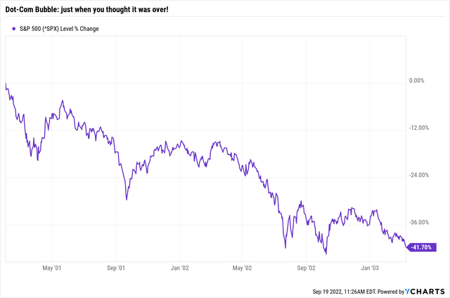
So that initial decline and recovery, which netted the S&P 500 about a 10% loss, was succeeded by a whopping 40%+ decline. The S&P 500’s most recent rally topped out at around 4,300. Take 40% off of that, and you are in the 2,600 area. As history would have it, that was the better of the first two bear markets of this century.
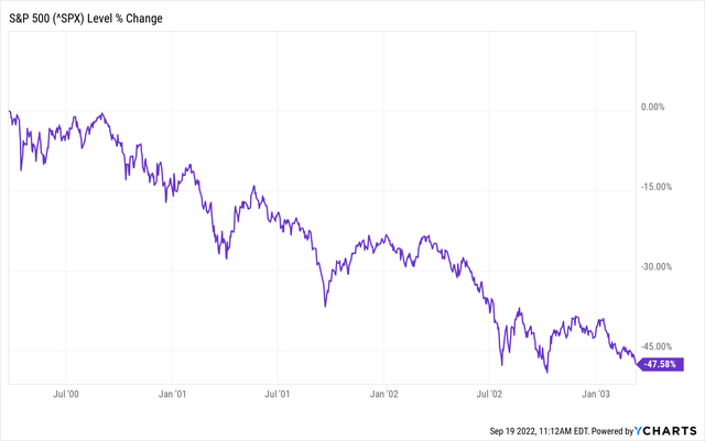
Historical Evidence: Global Financial Crisis
If you are keeping score at home, the dot-com bust meant that index fund investors had to double their money just to earn a zero return since the start of that time frame. And they did exactly that, from 2003 through 2007.
And then, it happened again. Here’s the S&P 500 from October 2007 through March of 2009.
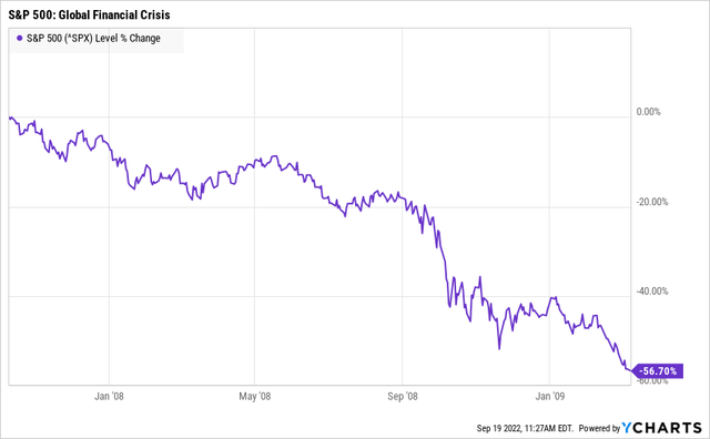
Once again, there was the initial drop, the “it’s only a flesh wound” (with apologies to “Monty Python”) phase, and then this from August 2008 through March 2009.
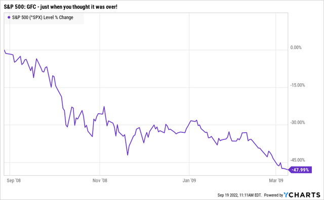
The net result, as the previous chart showed, was a 56% drop from the peak. If you had invested in an S&P 500 Index fund on Jan. 4, 2022, and the 2007-09 down move repeated itself, your ultimate destination would be around 2,100. So, a move from S&P 4,800 down to 2,200 in the coming year or two doesn’t seem so unlikely.
Observations and Conclusions
Stock market analysis and evaluation of risk is never an all-or-nothing proposition. Instead, it is about evaluating as many possible scenarios as you can, including some realistic but generally unthinkable ones. After all, any investment can go up at any time. What distinguishes any security and any market climate from any another is the amount of major risk you are taking when you put that capital to work.
Here in the final third of 2022, and considering potential reward and risk through to 2023, my conclusion is that the level of market risk is currently at a historically high rate.
The Good News for Bulls (for Now)
That doesn’t mean 2,200 is a given. It just means that the odds favor much more downside from here. Whether by way of the Fed’s magic wand or some change of heart by a hoard of investors, the S&P 500 could reverse course, get happy again, and move toward and above that all-time high and above 5,000. It could happen this year or next year. One never knows.
But if you are “counting” on that based on the fact that we have not had a sustained decline in the S&P 500 in over 13 years, you are investing with rose-colored glasses. Inflation is the new wildcard, and was not an issue during the periods shown above.
Furthermore, the nature of market participants has changed, with piles of money flooded into index funds, and so much short-term trading by professional and retail investors alike. The odds of something breaking are high. And the S&P 500’s chart is telling us that. We just need to listen.
What to Do if I’m Right
As my team and I will cover extensively and exclusively at Seeking Alpha in the days, weeks, and months ahead, there is a wide variety of investment weapons available to investors today. These allow them to not simply defend bear markets in stocks and bonds, but exploit them for profit. But before any investor can consider that step, they must first acknowledge that at the present time accounting for risk of major loss, so you can prevent it, should be every investor’s top priority.
The Key: Mix Offense and Defense in Portfolios
I truly believe markets are at a critical crossroads. That means the tremendous wealth accumulated over the past decade is at risk, for those who don’t know how to mix defense with their offense. The bottom line is that this autumn, we find ourselves in a market climate that is only rivaled by the last two times investors saw half of the index funds’ value disappear. Be careful out there, and learn how to navigate this new and, dare I say, historic climate.
Photo by Jan Baborák on Unsplash